Since its inception, 1-54 has brought together 54 African countries to celebrate the incredible art and creativity of 1 continent and its diaspora.
From our first edition in London, we have grown as a fair; we have helped launch artists and galleries onto the international stage. We are excited to unveil our new brand identity that confidently celebrates our position as a leading fair for contemporary art. Our identity puts the spotlight on togetherness; a bold and contemporary interpretation of unity and pride of our continent. It draws attention to our role as a unifier of many things – people, countries, cultures, and art forms.
We have taken time to reflect on what we’ve achieved and where we are headed. After the last two years where we have been kept at a distance from one another, the concept of togetherness feels even more crucial, as well as the need for cross-cultural conversations and exchange. In collaboration with design studio, TM, we invite you to celebrate our 10th anniversary with this new logo that reflects our ongoing mission to promote contemporary art from Africa and its diaspora.
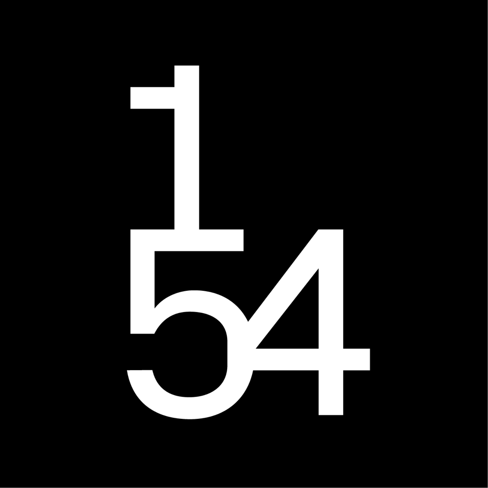
The new identity embodies this unity by merging the three numbers, creating a contemporary and confident symbol that acts as a figurehead for the brand. The unusually angular numbers have a bold and provocative feel, fit for the next stage in the fair’s evolution. The logo itself has a new clarity to its forms which will help with its legibility and subsequently its connection with broader audiences who are not yet aware of the wonders of the fair.
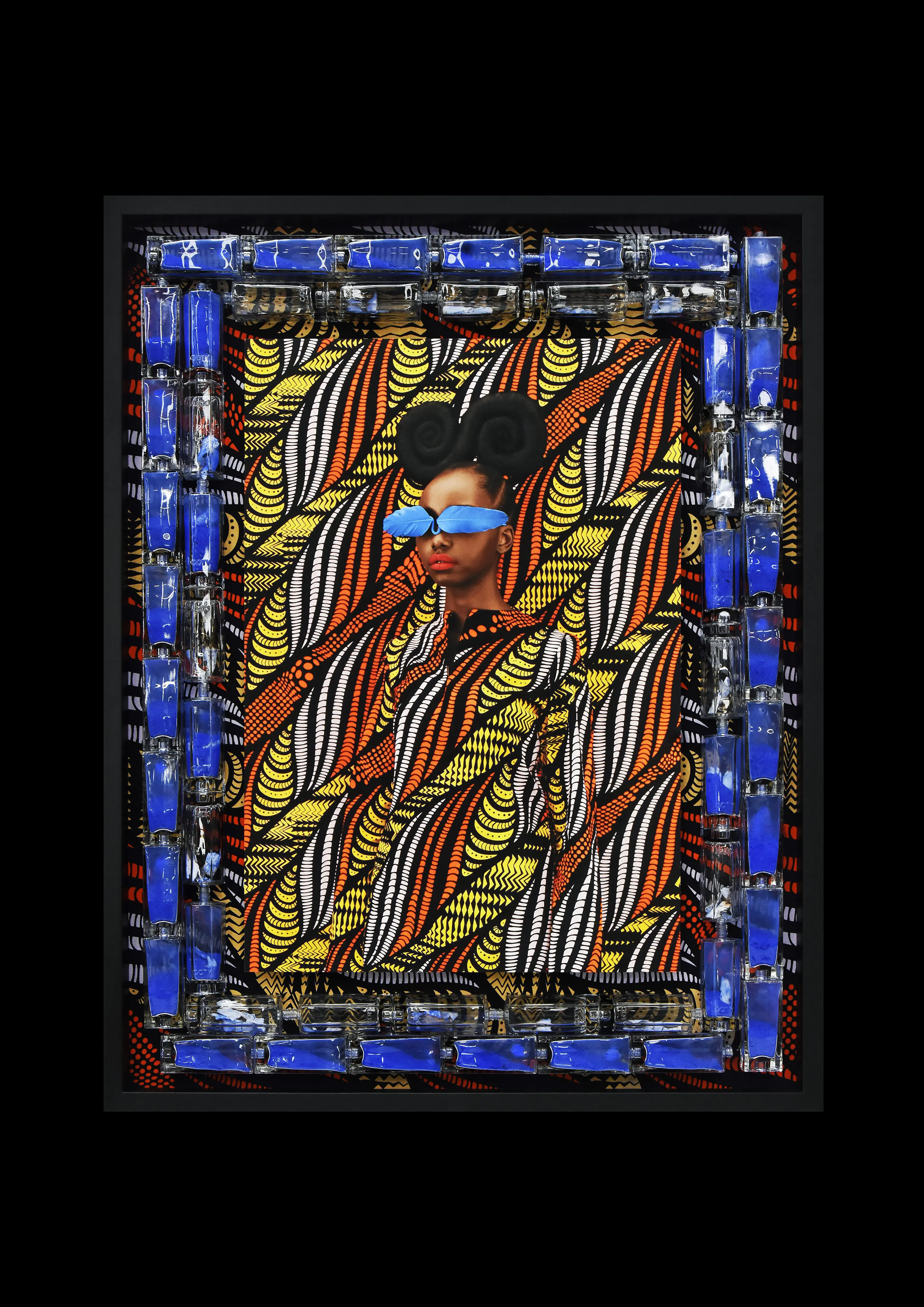
By stacking the numbers, there is also a natural corner created in the logo. We use this to hold beautiful work from the fair, which in itself is an analogy of our role as a platform for exchange.The typeface emulates the same geometry as the new logo, with quite unique angular corners introduced into a number of the characters of the typeface. These features take the typeface beyond a traditional sans serif and into something more characterful and exciting, much like the fair itself. While there is a lot of flexibility in the new brand, the first year will focus primarily on the new shapes and forms of the new symbol, using a monochrome palette as a kind of ‘reset’ to allow our friends and visitors to appreciate the new logo and identity without any other distractions.
The 1-54 Team